Louis Jou
(1881-1968)
“The Word was made flesh” (John 1:14, KJV) is a cornerstone concept of Christian faith and art. French-Catalan Graphic Designer Louis Jou grasped this theological truth in a more visceral way than many traditional religious artists. He made words come alive on the printed page through his imaginative manipulation of fonts and typefaces, lay-outs and text blocking, ornamentation and illustration. Known as the “Architect of Books,” Jou was unique among the publishers of his time in designing, illustrating, type-setting, and printing texts on his own, even creating the actual letters. He believed every printed volume should be a work of art, whether Machiavelli’s The Prince or The Gospel According to St. Matthew.
The son of a belt maker and a seamstress from a town on the outskirts of Barcelona, Luis Felipe-Vicente Jou i Senabre was apprenticed at the age of eight without formal schooling to the city’s largest publishing house. A library curator and artistic consultant for the firm took an interest in this illiterate errand boy with a fascination for the look of letters and found Jou work in the book collection, while he studied reading and writing after hours. As Jou later recalled: “For three years, I lived like a moth among manuscripts, devouring Greek and Latin, all the classics--what a paradise!” Employed, next, as a sign painter and interior decorator, the future book maker excelled in calligraphy, inscription, and all manner of ornamentation.
In 1906, Jou settled in Paris and first put his gift for elegant lettering to use at La Belle Edition, a small literary publishing house. He counted among his clients leading writers of the day like Anatole France, Jean Cocteau, and Andre Saures, a close collaborator of Georges Rouault who became his lifelong friend. In 1927, Jou rented studio space at 13 Rue du Vieux-Colombier, where he created some of his most prized texts and prints over the next 12 years, engraving intricate images into pear wood blocks with an assortment of gouging tools, working out the numbness in his fingers later by playing Bach on a harmonium. The Collection has a rare print block of the Crucified Christ. When World War II engulfed Europe, Jou settled in the village of Les Baux de Provence in Southern France, where he restored a Renaissance-era mansion and set up a new workshop for his hand presses.
Jou’s typeface designs were inspired by 15th century incunables (the first printed texts) and his illustrations, by master North European printmakers like Albrecht Durer. While French forces were engaged in trench warfare along the Western Front in 1915-1916 in World War I, Jou created a harrowing cycle of prints of the Stations of the Cross, recalling Durer’s Large Passion series of 1511 in their rich tonality and complex multi-figured compositions. Jou’s talent for graphic design is beautifully showcased in the lettering of the title page and the Station texts and in this suite of 15 wood engravings in the Sacred Art Pilgrim collection. There is a suggestion of the Passion paintings of Hieronymus Bosch in the brutish revilers of Jesus, who seems too fragile a figure to be carrying the sins of the world on his shoulders. He is the eternal victim, epitomizing human sorrow and suffering in a time of violence and barbarity.
Jou created a masterpiece of sacred text art in his 1928 hand-printed edition of The Gospel According to Saint Matthew in the 17th century French translation of Louis-Isaac Lemaistre de Sacy. He hand carved 30 full-page wood engravings to illustrate L'Evangile selon Saint Matthieu in a style similar to his Stations of the Cross prints. He created another 28 decorated chapter headings and 28 end-of-text embellishments, recalling medieval illuminated manuscripts. Every page and block of text is a harmoniously balanced work of art in red and black ink. Not a single word is broken at the end of a line. In a final decorative colophon, mimicking traditional sacred manuscript inscriptions, Jou said he was inspired to create his Gospel text in a dream in which he returned in time to an age of faith. He concludes with thanks and praise to the "Creator of Everything."
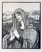
Jou used the medium of wood engraving to maximum effect both in his book illustrations and individual prints. He offers us eight variations on the portrait of Christ on a single sheet in what appears to be a study for his 1934 suite on the Life of Christ. In his sumptuous depiction of the Annunciation, he expands the conventional two-figure format to include a richly-arrayed heavenly orchestra, celebrating the Virgin Mary's assent to become mother of the Christ Child. Images of Pieta usually depict the Virgin, cradling the body of her son, just taken down from the Cross. In Jou's variation on this traditional theme, the Mother of Christ stands alone with Golgotha in the distant background. The agitated engraving marks in her garments, which extend into the landscape and end in serrated mountain peaks, are the real bearers of emotion in this Art Nouveau-styled print.
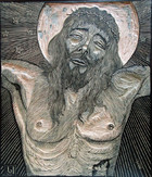
The Crucified Christ
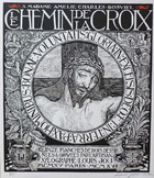
Title Page
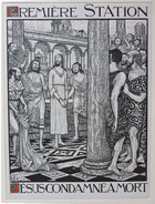
Station I
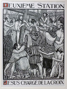
Station II
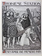
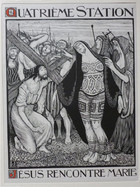
Station IV
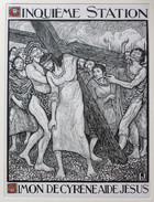
Station V
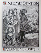
Station V
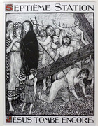
Station VII
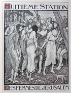
Station VIII
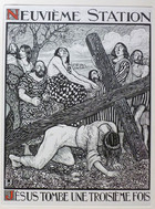
Station IX
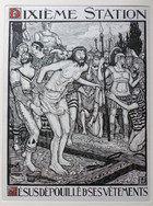
Station X
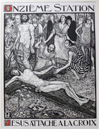
Station XI
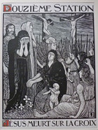
Station XII
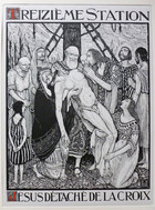
Station XIII
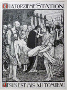
Station XIV
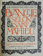
The Gospel of St. Matthew, Title Page
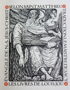
The Gospel of St. Matthew (Frontispiece)
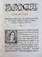
The Gospel of St. Matthew (Chapter I)
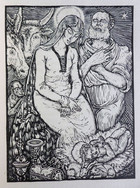
The Gospel of St. Matthew (Chapter II)
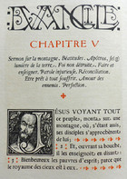
The Gospel of St. Matthew (Chapter V)
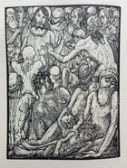
The Gospel of St. Matthew (Chapter XIII)
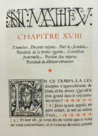
The Gospel of St. Matthew (Chapter XVIII)
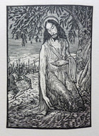
The Gospel of St. Matthew (Chapter XXVI)
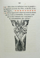
The Gospel of St. Matthew (Chapter XXVIII)
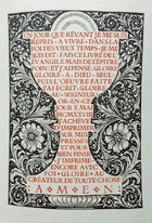
The Gospel of St. Matthew (Colophon)

Faces of Jesus
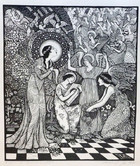
The Annunciation
